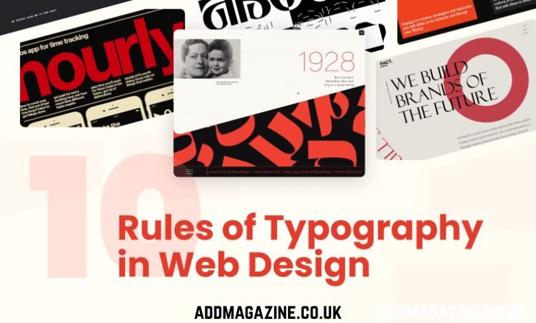
Bad typography kills conversions faster than slow page loads. Test your font choices and watch revenue shift 15-20%. I’ve seen it happen dozens of times.
Typography isn’t decoration. It’s the functional architecture that determines whether users actually read your content, trust your brand, or bounce in three seconds. Custom web design services get it right? You guide attention exactly where you want it. Get it wrong? Your messaging becomes an unreadable noise.
Here’s what actually drives results.
Why Typography Controls User Behaviour
Do users read your content before judging you? Wrong. Every website visitor makes instant credibility judgments within 50 milliseconds. Typography communicates before they read a word. Professional or amateur. Trustworthy or sketchy. Worth their time or instant close.
Readability reduces cognitive load. Users process well-typeset content 30% faster than poorly formatted text. That speed difference? It determines whether they engage or abandon competitors.
Font choice expresses brand personality more effectively than color schemes or imagery. Financial services using Comic Sans? Trust destroyed. Tech startups using Garamond? Innovation questioned. Alignment between typeface and brand values isn’t optional.
Typeface Selection: Strategic, Not Aesthetic
Choosing fonts based on “what looks nice” is amateur hour. Strategic selection aligns typeface characteristics with your brand positioning. Let me break down what actually matters.
Should You Choose Serif or Sans-Serif?
Context determines everything. Serif fonts (Times New Roman, Garamond, Georgia) convey tradition and authority. Perfect for finance, law, publishing, or established institutions.
Sans-serif fonts (Helvetica, Arial, Open Sans) offer modern, clean aesthetics. Higher legibility at small sizes makes them dominant for screen body text. Technology companies and startups love them for good reason.
| Font Category | Brand Perception | Best Use Cases |
| Serif | Traditional, authoritative | Finance, law, luxury |
| Sans-serif | Modern, efficient | Tech, startups, minimalist brands |
| Display | Creative, bold | Headlines only |
| Monospace | Technical, precise | Code samples, data tables |
Display fonts? Headlines only. Never body text. They’re designed for impact, not sustained reading.
How Many Fonts Should You Actually Use?
Limit to two or three typefaces maximum. One for headings, one for body text, optional accent for emphasis. More fonts create visual chaos that undermines comprehension.
Pair complementary typefaces considering contrast and harmony. Geometric sans-serif headline with humanist sans-serif body creates subtle distinction. Serif headline with sans-serif body provides stronger contrast while maintaining readability.
Hierarchy and Scale: Directing Attention
Clear typographic hierarchy separates professional design from amateur confusion. Users need instant recognition of content importance. No conscious analysis required.
What Font Sizes Actually Work?
Establish systematic scale relationships between elements. Random sizing creates disorganisation. Mathematical relationships create clarity.
Typical responsive sizing:
- Headlines (H1): 32-48px desktop, 24-32px mobile
- Subheadings (H2-H3): 24-32px desktop, 18-24px mobile
- Body text: 16-18px (never smaller than 16px)
- Captions: 12-14px minimum
Use modular scale ratios (1.25, 1.33, 1.5, 1.618) to maintain proportional relationships. Your typography should feel systematically organized, not arbitrarily sized.
Do Weight and Style Changes Actually Matter?
Absolutely. Font weight variations create hierarchy without size changes. Bold weights (600-700) draw immediate attention. Regular weights (400) suit sustained reading. Light weights (300 or below) work for large display text but struggle at body sizes.
Italics emphasize quotes or citations. But overuse destroys effectiveness. Reserve for specific functional purposes.
All caps? Reduces readability by 10-15%. Use sparingly for short labels, never for paragraphs.
Readability Engineering: Reducing Friction
Legibility and readability aren’t identical. Legibility means individual characters are distinguishable. Readability means sustained comprehension remains effortless. Both matter. Optimise for both.
What Line Length Maximises Comprehension?
Target 50-75 characters per line for optimal reading rhythm. Shorter lines feel choppy. Longer lines cause users to lose their place, increasing cognitive effort and abandonment.
Responsive design requires flexible line lengths. Use max-width constraints (typically 60-80ch). This prevents excessive expansion on wide screens while allowing natural reflow on narrow devices.
How Does Line Height Affect Reading Speed?
Set line-height at 1.4-1.6 times font size. Too tight (1.2 or below)? Cramped, difficult text. Too loose (1.8+)? Disconnected lines that slow comprehension.
Body text typically needs 1.5-1.6 line height. Headlines handle 1.2-1.3 because fewer lines mean less confusion.
Does Contrast Actually Matter?
Minimum 4.5:1 contrast ratio between text and background meets WCAG AA standards. Optimal readability demands 7:1 or higher for body text.
Light grey text on white backgrounds fails accessibility requirements and strains vision. Dark text on light backgrounds (#212121 on #FFFFFF) provides 16:1 contrast ensuring readability.
Avoid pure black on pure white. The harsh contrast causes eye strain. Soften to dark gray (#212121) on off-white (#FAFAFA) for comfortable, sustained reading.
Responsive Typography: Fluid Across Devices
Static font sizing fails modern multi-device usage. Your typography must scale intelligently from 320px phones to 2560px monitors. No manual intervention at every breakpoint.
Should You Use Pixels or Relative Units?
Use rem or em units for font sizing. This ensures consistency across screens and respects user browser settings. Pixel units ignore accessibility preferences and break when users adjust default font sizes.
css
body { font-size: 16px; } /* Base size */
h1 { font-size: 2.5rem; } /* 40px relative to base */
p { font-size: 1rem; } /* 16px relative to base */
Rem units reference root font size. Em units reference parent font size. Rem provides more predictable scaling.
How Do You Implement Truly Fluid Typography?
CSS clamp() function enables dynamic scaling between defined minimums and maximums:
css
h1 { font-size: clamp(1.75rem, 5vw, 3rem); }
This scales from 28px minimum to 48px maximum based on viewport width. It eliminates breakpoint maintenance while maintaining readability across all devices.
Performance Optimisation: Speed Matters
Custom fonts enhance brand identity but destroy performance if implemented poorly. Every 1-second load delay reduces conversions by 7%. Typography shouldn’t be why your site loads slowly.
How Do You Load Fonts Without Breaking Performance?
Subset fonts limit character sets to only needed glyphs. Full font families include hundreds of characters you’ll never use. Loading complete files wastes bandwidth.
Font-display: swap prevents invisible text during loading. Browser shows fallback system fonts immediately. Users see content instantly rather than blank screens.
css
@font-face {
font-family: ‘CustomFont’;
src: url(‘font.woff2’) format(‘woff2’);
font-display: swap;
}
Preload critical fonts in the document head:
html
<link rel=”preload” href=”font.woff2″ as=”font” type=”font/woff2″ crossorigin>
Limit font variations. Loading regular, italic, bold, and bold-italic for two families means eight font files. Each adds load time. Use only weights you actually need.
Should You Self-Host or Use CDN?
CDNs (Google Fonts, Adobe Fonts) simplify implementation but introduce third-party dependencies and privacy concerns. GDPR compliance becomes complicated when fonts load from external servers.
Self-hosting grants complete control over performance, privacy, and reliability. No external dependencies mean no external points of failure. You manage licensing and optimization yourself.
Bottom Line
Most websites treat typography as an afterthought. Choose defaults, adjust sizes until “it looks okay,” ship it. Then wonder why conversions underperform.
Strategic typography engineering considers cognitive load, emotional response, accessibility requirements, performance constraints, and device variety simultaneously. Berks Technologies. It’s systematic optimisation, not aesthetic preference.


