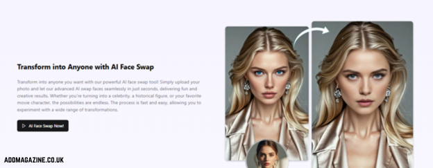
Scrolling Twitter (or X), you can spot the difference between a post that lands and one that gets ignored in half a second. The human brain does not usually process texts that fast, so images define this first impression. A sharp visual makes people pause. If your picture is blurry, too cropped, or stretched, people are less likely to read the caption.
The tricky part is that Twitter (X) does not display a single image the same way everywhere. You might see a perfect shot from your laptop, but it could look completely distorted on your phone or tablet. A header can trim the edges. A link preview can shrink your text to the point of unreadability. To find a way out of this trouble, you should learn about Twitter image sizes.
In this article, we will provide information on the most common and effective Twitter picture sizes. You will also master practical, effective layout tips for crisp, consistent, distortion-free images.
A Quick Cheatlist You Can Trust
Even if you have a perfect image, the wrong Twitter image dimensions give the impression that something is off. A simple rule that saves time: pick the right aspect ratio first, then scale up or down without stretching. If you have a design you love, but you want to ensure it fits your feed, setting the necessary parameters in your image resizer is the first step.
| Use case | Recommended size (px) | Aspect ratio |
| Profile photo | 400 × 400 | 1:1 |
| Header/banner | 1500 × 500 | 3:1 |
| In-feed single image | 1600 × 900 | 16:9 |
| Link preview image | 1200 × 628 | 1.91:1 |
In the following sections, we will explain why these sizes work in each given case and provide layout tips to make your social media feed noticeable.
The Profile Basics
If your avatar looks fuzzy or your header cuts off the main message, readers will not care about how great and informative your posts are. The annoying part is that Twitter/X changes how these elements show up depending on the screen. Your profile photo may look square in your editor, but it displays as a circle in the app. With the right approach, you won’t let these nuances ruin your online identity.
Profile Picture
Do not crop your face or logo too tightly. Ensure the circular frame does not clip out any important details. If you use text in a logo, keep it big and simple. The text in your logo is not obligatory, though; you can write your slogan in your profile bio. Use small, lightweight original files instead of compressing a high-resolution shot.
Banners and Headers
As we said, the perfect Twitter banner size is 1500 × 500px. It will work best if you place your main subject (the most important element) in the center, because edges in banners are often trimmed. Avoid placing important text in the lower-left corner, as your profile photo often overlaps that area on many layouts. Stick to lightweight file formats like JPG for a smooth upload.
Posts That Grab Attention
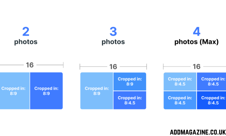
When you post a photo or graphic on Twitter/X, be ready for different perceptions, and it does not matter what is in your image. Keep your frames consistent and controlled (at least as much as you can; we know the platform often changes dimensions against the users’ will).
Single-Image Posts
A single-image tweet is the easiest format to make look consistently good. A wide layout usually behaves well in the timeline and gives your main subject enough room to breathe. Stick to the “perfect” Twitter picture size of 1600 × 900 for your single-image posts. Avoid tiny text, because compression can make it too soft and unreadable. Preview your photo on different screens to ensure the most important elements are clearly visible and not close to the edges.
Link Previews
Previews are usually much smaller than the content they refer to, so it is easy to make them misleading. For X Cards, 1200 × 628 px (1.91:1) is a common, reliable choice that keeps the preview crisp and balanced. Your preview should have one clear focal point, be bold, and highly contrasted.
If you are sharing a blog post, match the image to the headline so the preview feels reliable and other people want to click on it. Small details usually remain unnoticed in feed, and file compression softens them out. Avoid lengthy text and prioritize minimalist graphics over detailed collages in your previews.
Conclusion
You do not need advanced design skills to create good Twitter/X posts. Pick a consistent template for your profile, stick to a predictable shape for posts, and treat link previews like thumbnails, not full posters. You will spend less time addressing mistakes and more time publishing content that looks clean, confident, and worth stopping for.