
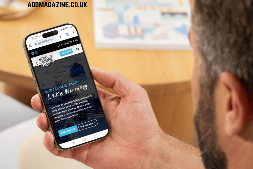
A website may look impressive on a desktop screen, but that is only part of the job. Customers now browse, compare products, make enquiries and complete purchases from smartphones and tablets throughout the day. If a website is difficult to use on a smaller screen, visitors are unlikely to wait around for the experience to improve.
That is why mobile responsive website design has become a core requirement for modern businesses. Professional website design services can help create a responsive website that automatically adapts its layout, images, menus and content to suit the device being used. Instead of forcing mobile visitors to pinch, zoom or scroll sideways, the site presents information in a clear and usable format.
For SMEs, ecommerce brands and growing businesses, a mobile-friendly experience can influence first impressions, search visibility and conversion rates. Responsive design is not simply about making a site look better on a phone; it is about creating a smoother customer journey across every screen size.
Mobile User Behaviour Has Changed the Way Websites Need to Work
Mobile users often want information quickly. Someone might search for a service during their commute, compare local businesses while they are out, or look for contact details before getting in touch. A website therefore needs to communicate its key information clearly as soon as the page loads.
Usability issues are much easier to notice on a smaller screen. Tiny text, closely placed buttons, oversized images and complicated navigation can make a website frustrating to use. If visitors struggle to find the information they need, they may leave the website and choose another business instead.
Effective mobile responsive website design takes these behaviours into account. Navigation should be simple, text should be easy to read, buttons should be easy to tap, and important information should be accessible without unnecessary scrolling or searching.
Effective mobile responsive website design considers how people actually interact with a site. Important calls to action should be easy to tap, menus should be straightforward, content should be broken into readable sections, and forms should be simple to complete. The aim is to reduce unnecessary effort and help users move naturally towards the information, product or service they need.
Responsive Layouts Create a Consistent Experience
A responsive layout allows the same website to work across a wide range of devices without requiring a completely separate mobile version. The design adjusts intelligently depending on the available screen space, helping maintain a consistent brand experience.
Good responsive layouts are flexible rather than fixed. Columns may stack vertically on smaller screens, navigation menus may collapse into a mobile-friendly format, and images can resize without breaking the page structure.
For businesses looking for professional responsive web design, this approach provides a practical way to create a website that works for both desktop and mobile users without sacrificing design quality.
Consistency also helps build trust. Visitors should not feel as though they are viewing a reduced or incomplete version of the business website simply because they are using a phone. Key information, branding, products, and calls to action should remain accessible regardless of screen size.
Mobile Optimisation Supports Better SEO Performance
Search engines want to provide users with pages that offer useful information and a positive experience, including on mobile devices. A poorly designed mobile experience can therefore limit how effectively a website performs in organic search.
Mobile optimisation involves much more than adapting a desktop layout for a smaller screen. Page speed, image sizes, navigation, content structure and technical performance all influence how well a website works on mobile devices. A responsive website should load quickly, display important content clearly, and avoid features that are difficult to use on touchscreens.
Responsive design can also support SEO by keeping users on one consistent URL rather than splitting content across separate desktop and mobile versions. This makes the website easier to manage and reduces the risk of inconsistent content.
If organic visibility is part of your growth strategy, combining strong mobile design with professional SEO services can help ensure the website is built with both users and search performance in mind.
A Mobile-Friendly Website Can Improve Conversions
It should make it easy for visitors to take the next step, whether that means requesting a quote, calling the business, completing a booking, or purchasing a product.
Mobile responsive website design can remove friction from these actions. A clear call button, a short enquiry form or a simple checkout process can make a significant difference when someone is using a smartphone.
Forms are a common problem area. Long forms with unnecessary fields can feel particularly demanding on mobile. Asking only for essential information can make the process quicker and more convenient. Buttons should also be large enough to tap comfortably, while confirmation messages should clearly explain what happens next.
For ecommerce businesses, mobile optimisation is especially important because customers may browse and buy entirely from their phones. Product images, descriptions, filters, baskets and checkout pages all need to work smoothly on smaller screens. A complicated mobile checkout can undermine all the work that brought the customer to the site.
Conversion improvements are often the result of many small usability decisions working together. Faster pages, cleaner layouts, visible calls to action, and simple navigation can all help visitors feel more confident about moving forward.
What Should Businesses Look for in Responsive Web Design?
A responsive website should be designed around the needs of its users. Mobile usability should be considered from the start, rather than added as a final adjustment.
Businesses should focus on simple navigation, readable text, and fast-loading pages. Images should resize correctly across different devices. Calls to action should also be easy to find and use.
Forms should be simple and quick to complete on mobile. Buttons need enough space around them so users can tap them easily. The website should also be tested on different screen sizes to make sure the layout works correctly.
Content should be clear and easy to scan. Short paragraphs, descriptive headings, and a logical page structure can help visitors find information faster.
Regular testing is also important. New content, plugins, and design updates can affect mobile performance. Checking the website regularly can help identify and fix usability issues before they affect visitors.
Why Mobile Responsive Website Design Matters for Business Growth
Mobile responsive website design is no longer an optional extra. It plays a central role in user experience, search performance, brand perception and conversion potential.
A responsive website helps customers move smoothly between devices while giving businesses one consistent platform to manage and improve. It can reduce frustration, support mobile optimisation and make important actions such as enquiries, bookings and purchases easier to complete.
For businesses planning a new website or reviewing an existing one, mobile performance should be considered throughout the design process. The strongest websites are not simply attractive on a large screen; they are clear, fast and easy to use wherever customers choose to browse.
BoostOnline can help businesses create websites designed around usability, performance and commercial goals. If your current website is difficult to use on mobile or no longer reflects the way customers browse, reviewing its responsive design could be an important next step.