A profile visit is a brief, useful moment. Someone may have found a Reel, seen you tagged by a friend or clicked through from a local recommendation. Before they explore further, can they understand what your account covers, who it is for and what they might see if they follow?
The “three-second test” is a practical first-impression exercise, not an official Instagram rule. Meta does not publish a universal three-second threshold for follows, nor is there a verified profile-visit-to-follow benchmark to aim for. The point is simpler: reduce the amount of guessing an unfamiliar visitor has to do.
What a visitor sees first — and what takes more effort
Make the essentials clear before asking visitors to explore further.
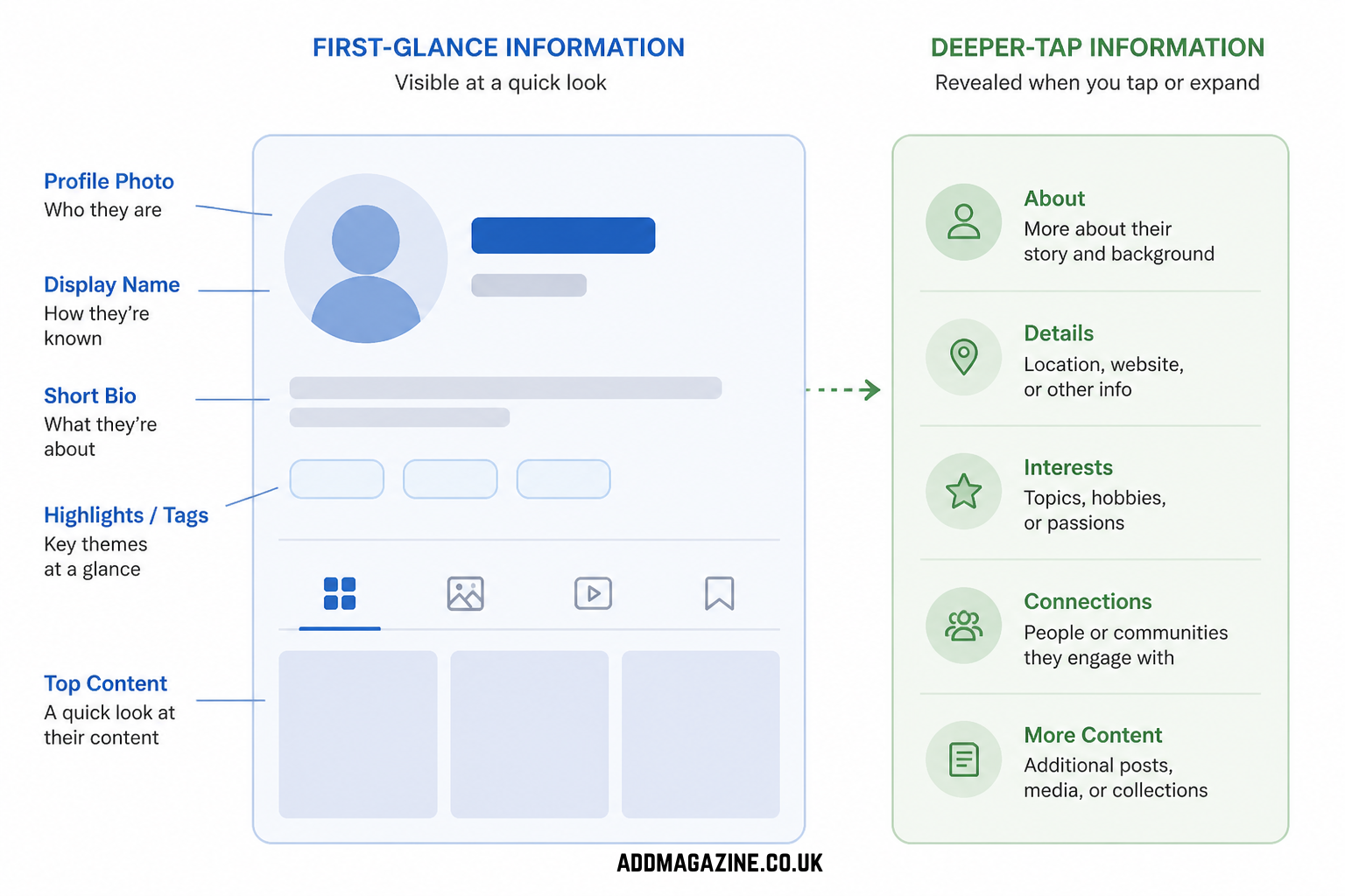
Profile layouts can vary by device, account and app version, but the initial view commonly presents a profile photo, username, name field, bio and some recent content. A visitor may also see a link and pinned posts, depending on the current layout.
Other information asks for more effort: opening a link, tapping a pinned post, viewing Highlights, reading captions or scrolling through the grid. That creates a useful hierarchy. Your immediate signals should establish the basics; deeper elements should reward curiosity.
A detailed Highlight cannot fully explain an unclear bio, and a strong pinned post is less useful if a visitor cannot tell why they should tap it. Start with the information people can absorb at a glance.
The five-part profile audit
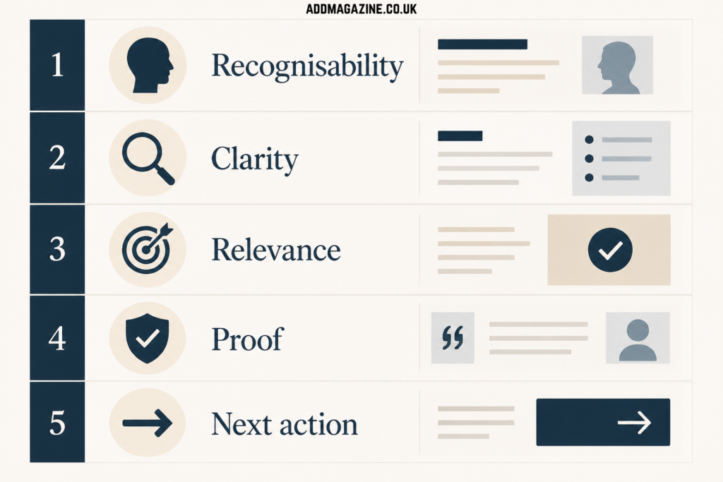
Use the five questions as a review framework, not a growth formula.
Use this framework as a review tool, not a formula for guaranteed growth:
- **Recognisability** — can someone identify you or the business at a small size?
- **Clarity** — can they quickly understand the subject and point of view?
- **Relevance** — do visible posts support that promise?
- **Proof** — is there something useful that demonstrates your work, experience or approach?
- **Next action** — is there an obvious place to begin?
1. Make the profile recognisable
For a personal account, a clear, well-lit head-and-shoulders photo can be easier to recognise than a distant group shot or a busy collage. For a small business, a simple, consistent mark may work well if it remains legible in a small circular crop.
Check the image on a phone at normal viewing distance. Can you recognise the face, shape or mark without zooming in? Avoid tiny lettering, crowded compositions and details that disappear at thumbnail size.
Accessibility is worth considering, especially where a profile image or post cover includes text. W3C’s WCAG 2.2 gives contrast guidance for text and images of text, including a 4.5:1 contrast ratio for normal-sized text. That is a helpful design reference, rather than a direct requirement for every Instagram profile image, logo or photograph. In practice, generous type size and clear contrast are usually more useful than squeezing a slogan into an icon.
2. Clarify the username and name field
A handle may be playful, longstanding or limited by availability. The name field can provide plain-English context.
A Manchester food creator might use “Maya | Manchester food”, while a freelancer could choose “Aisha Khan | Personal stylist”. A local ceramics studio might include its town and product category. These are orientation cues, not a reason to pack in every possible keyword.
Use language that people naturally use to describe you, your service or your subject. It may help a visitor make sense of the account, but it should not be treated as a guaranteed search-ranking tactic.
3. Write a value-led bio
A bio does not need to contain your full CV. It should help a newcomer answer three questions:
- What do you share or offer?
- Who is it likely to interest or help?
- What can a follower expect?
For example, a fictional UK lifestyle creator might write:
> Budget-friendly UK weekends, independent cafés and coastal walks. Ideas for days out without the glossy travel brochure.
That is an example, not a formula. A fashion creator could mention outfit repeats and practical styling; a fitness professional could set out the type of training they discuss; a florist might state their area and event focus.
Personality still matters. “Coffee-first guide to Bristol” gives more character than “Lifestyle creator”, while retaining a useful signal. If the bio is only vague slogans, inside jokes or a long string of emojis, visitors have to work harder to understand it.
4. Build relevant proof
Proof is not about making grand claims or filling a profile with logos. It is about giving someone a reason to believe that the account has a genuine perspective, useful work or a reliable focus.
For creators, proof might be a pinned post explaining a recurring series, a practical guide that shows how they approach a subject, or an example of their photography, writing or editing style. A food creator might pin a considered neighbourhood guide; a travel creator might point to an itinerary with clear, first-hand practical notes.
For freelancers, proof can be a portfolio example, a short explanation of their process, an FAQ or a case-study-style post that describes the work without sharing confidential client details. A photographer could show a selected shoot and explain the brief; a stylist could show how they build a capsule wardrobe around a client’s stated needs.
For small businesses, useful proof may include product detail, an introduction to the people behind the business, service information, location details or customer feedback shared with permission. A café might pin its menu approach and accessibility information; a fitness studio might organise beginner information and timetable updates clearly.
None of these elements proves authority to every visitor or guarantees an enquiry or follow. They simply give an unfamiliar person something concrete to assess.
5. Give people one useful next action
A profile link or call to action can turn interest into a sensible next step: viewing a portfolio, making a booking enquiry, reading a city guide or browsing a relevant collection.
Match it to why someone is likely to be visiting. “View recent shoots” is clearer for a photographer seeking commissions than a generic instruction. An editorial travel account could point to its latest guide. Begin with one priority rather than presenting several competing requests.
Pinned posts can do similar work. Consider using them for a short introduction, a representative piece of content and one helpful proof or FAQ post. Highlights can add depth around recurring topics, behind-the-scenes material, reviews, services or location information. Keep labels short and readable, and archive material that no longer helps a new visitor.
Check the current app before publishing or planning around a particular profile feature: labels, placement and availability can change.
Make the first nine posts support the promise
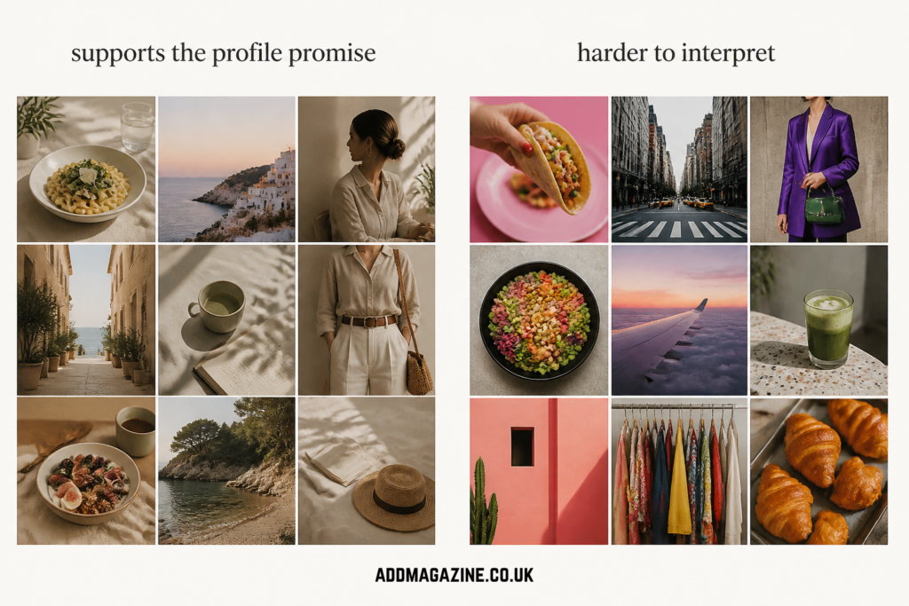
Recent posts should broadly make sense alongside the account’s stated focus.
Recent posts offer a quick sample of the account’s present reality. They need not be perfectly colour-coordinated, but they should broadly make sense alongside the bio.
Think in terms of a recognisable rhythm:
- **Food:** restaurant visits, home recipes and useful local lists.
- **Fashion:** outfit breakdowns, wardrobe advice and personal perspective.
- **Travel:** practical itineraries, place-specific recommendations and honest trip moments.
- **Fitness:** clear demonstrations, explanatory posts and realistic recovery or routine notes.
- **Local lifestyle:** new openings, weekend ideas and familiar viewpoints on an area.
Consistency can come from tone, recurring formats, readable cover text or a familiar photographic approach. It does not require every post to look identical. Overly templated feeds can make everything feel like an advert, while a little variation can show range and personality.
Try a profile-promise check. If the bio says “easy weeknight recipes” but the visible posts are mainly event selfies and unrelated reposts, visitors may be unsure what following will bring. Personal posts can remain part of the account; the overall picture just needs to be intelligible.
Run an unfamiliar-visitor review
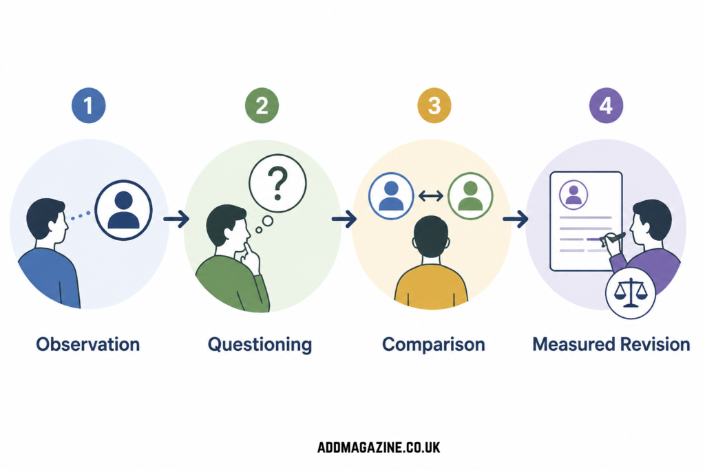
The gap between intended meaning and visitor interpretation can reveal useful improvements.
Give someone who does not know the account 10 minutes with your profile. Ask them to look without scrolling at first, then ask:
- What is this account about?
- Who do you think it is for?
- What would you expect to see if you followed?
- What would you tap first?
- What feels unclear or out of place?
Compare their answers with your intended profile promise. The gap is often more useful than a simple “Do you like it?” response.
Make one or two changes at a time, such as revising the name field and replacing one pinned post. Note the date and what changed. This will not isolate every variable: individual post performance, seasonality, collaborations and offline attention can all affect activity. It does, however, discourage giving all the credit or blame to one new bio line.
Measure account-specific signals
Professional accounts may have access to Insights and other professional tools. Use the metrics and labels available in your account to observe patterns in profile visits, follows and the relevance of the audience response over time. Availability and definitions can vary by account type, region, device and product changes, so treat the data as account-specific observations, not universal conversion targets.
Look beyond raw totals. Are the people visiting after a new series the people you want to reach? Are enquiries, saves, replies or website actions consistent with your purpose?
For readers who want a separate overview of follower growth and how to think about it, Brecktic has a practical guide to Instagram followers. For a longer-term progress review, this guide to Instagram follower milestones offers related context.
Keep profile clarity separate from algorithm claims
A clearer profile may help a human visitor understand an account. It does not demonstrate that Instagram will recommend the account more widely, favour a particular grid pattern or reward a specific bio format.
Instagram and Meta publish information about recommendations and Recommendation Guidelines, but this guidance should not be used to infer a guaranteed profile-visit-to-follow mechanism. Consult current Meta guidance when considering recommendation eligibility or distribution, and check it again immediately before publication or a major campaign because policies and product features can change.
A repeatable 10-minute checklist
- Is the profile photo recognisable at small size?
- Does the name field explain you or the account topic plainly?
- Does the bio make a believable content promise?
- Is the link relevant to that promise?
- Do pinned posts offer a clear starting point?
- Are Highlights current, labelled clearly and genuinely useful?
- Do recent posts broadly match the stated focus?
- Are cover images and text easy to read?
- Is there practical proof of your work, approach or service?
- Could an unfamiliar visitor describe the account after a quick look?
Review the profile after changing niche, offer or content direction. A well-organised profile cannot replace worthwhile content or guarantee a follow. It can make it easier for the right visitor to understand why they may want to stay.