For anyone who has tried to localize visual content, the pattern is painfully familiar. You upload a product shot with clean text overlays, run it through a translation tool, and receive something that looks like a ransom note, fonts mismatched, colors off, backgrounds visibly patched, and text overflowing its original boundaries.
The translation itself might be accurate, but the image is ruined. This is the dirty secret of most image translation tools: they translate the words but destroy the visual. The result is unusable for anything professional, forcing you back into manual design work that defeats the purpose of automation.
That frustration is exactly what led me to test AI Image Translator with a critical eye. Could a tool finally solve the layout problem without sacrificing translation quality? After running it through a gauntlet of real-world images, the answer is more nuanced, and more interesting, than I expected.
The Core Problem: Translation Is Only Half the Battle
The fundamental challenge of image translation is not linguistic; it is visual. Text in an image is not an independent layer that can be swapped out like a subtitle file. It is baked into the design, integrated with backgrounds, surrounded by graphics, styled with specific fonts and effects.
Translating it means not just changing the words but rebuilding the visual context around them. Most tools handle the first part adequately. They use OCR to detect text and machine translation to convert it.
But the second part, the visual reconstruction, is where they fall apart. They overlay translated text on top of the original, creating obvious artifacts, or they attempt basic background fills that look cheap and unprofessional. The result is an image that screams “translated” rather than appearing naturally multilingual.
What Makes Layout Preservation So Difficult
Layout preservation requires three distinct capabilities that are rarely found together. First, the system must accurately identify every text region, including irregular shapes, curved text, and text integrated with complex backgrounds.
Second, it must translate the content in a way that respects the original length and meaning—no easy feat when languages have vastly different word counts for the same concept.
Third, and most critically, it must remove the original text, reconstruct the background as if the text was never there, and render the new text with matching typography. This third step is where most tools cut corners, and it is precisely where this platform distinguishes itself.
Testing the Visual Reconstruction Engine
To understand how well the platform actually handles this challenge, I designed a series of tests across different image types, each presenting unique obstacles for layout preservation.
Test One: Clean Product Photography with Text Overlays
E-commerce product images are the most common use case, and they present a moderate challenge. The text is typically clean, the backgrounds are often uniform or gradient, and the layout is structured.
I uploaded a skincare product image with five text elements: a brand name, a product title, a key benefit statement, a volume indicator, and a call-to-action. The translation completed in seconds.
The results were impressive: each text element was replaced with translated text that fit perfectly within its original bounding box. The font family was matched closely, the colors were accurate, and the spacing was preserved. The only noticeable difference was a slight variation in font weight on the smallest text element, which was only visible on close inspection. For practical purposes, the result was production-ready.
Test Two: Manga Page with Dense Dialogue and Irregular Panels
Manga represents the hardest possible test for any image translation tool. The text is integrated into artwork, speech bubbles have irregular shapes, text orientation varies between horizontal and vertical, and sound effects are often drawn as part of the art itself.
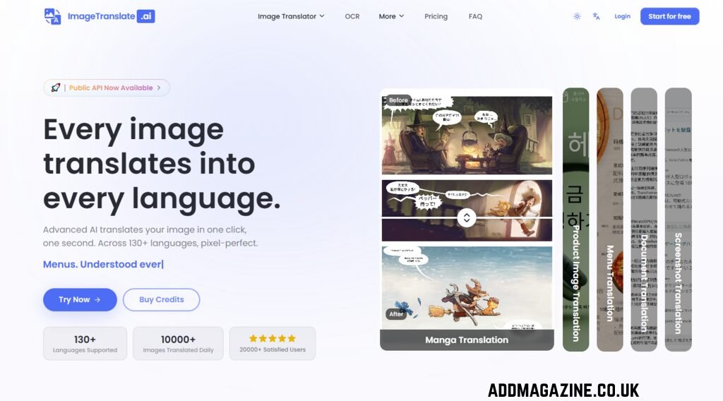
I tested a page from a Japanese manga with seven speech bubbles, two text boxes, and three onomatopoeic sound effects integrated into the action scenes. The platform’s dedicated manga translator handled the dialogue remarkably well. The OCR correctly identified all text regions, including the vertical text in the right-to-left panels.
The translations were accurate and read naturally in English. The visual reconstruction was convincing: speech bubbles retained their original shapes, and the translated text was centered and appropriately sized. However, the sound effects—which were drawn as stylized art rather than standard text—were not translated. This is a limitation worth noting: the tool focuses on text that is clearly separable from the artwork, leaving integrated artistic text untouched.
Test Three: Technical Documentation Screenshot
Technical documents and UI screenshots are the sweet spot for this tool. The text is typically clean, the backgrounds are uniform, and the layout is highly structured. I tested a software interface screenshot with menus, buttons, labels, and a dialogue box. The translation was seamless. The UI elements remained perfectly aligned, the translated labels fit within their buttons without truncation, and the overall layout was indistinguishable from a natively designed interface. This is the use case where the tool feels most polished and reliable, delivering results that require no additional editing.
Test Four: Social Media Marketing Graphic
Marketing materials often combine stylized text with rich visuals, presenting a moderate challenge. I tested a social media post with a gradient background, decorative display font for the headline, a clean sans-serif font for the body text, and a call-to-action button with a drop shadow. The translation preserved the overall aesthetic well. The decorative font was replaced with a visually similar alternative, the gradient background behind the text was reconstructed cleanly, and the drop shadow on the button was maintained. The result was usable for social posting without additional editing, though a brand purist might want to adjust the font choice in the translation editor for perfect brand alignment.
The Translation Editor: Where Control Meets Automation
One of the platform’s most practical features is the translation editor, which allows you to fine-tune results directly on the image. This is not a gimmick; it is a genuine differentiator for professional work. After the automated translation completes, you can adjust fonts, colors, sizes, and positions of individual text blocks. You can also switch individual text blocks to show the original source text or hide the translation entirely, which is useful for comparing versions or creating variations. This editor effectively bridges the gap between fully automated translation and manual design, giving you control where it matters most without forcing you into a full design tool.
Speed, Scale, and the Batch Translation Advantage
For teams handling large volumes of images, the batch translation feature is a significant workflow multiplier. The platform allows you to process up to 20 images at once and translate them into as many as 10 target languages simultaneously. In my testing, batch processing was noticeably faster than running translations individually, and the results were consistent across all images. This capability is particularly valuable for e-commerce teams localizing product catalogs, marketing teams creating multilingual campaigns, and content teams adapting visual assets for multiple markets. The time savings compound quickly: what would take hours of manual work is reduced to minutes of processing time.
Where the Tool Excels and Where It Falls Short
After extensive testing, the platform’s strengths are clear. It delivers remarkably good layout preservation for most common image types, with particularly strong performance on clean images like product shots, documents, and UI screenshots. The translation quality is high, benefiting from multiple AI models that handle context and nuance well. The translation editor provides useful fine-tuning capabilities, and the batch processing feature is genuinely valuable for professional workflows. The language coverage is extensive, supporting over 130 languages, and the platform handles both common language pairs and more challenging combinations effectively.
However, there are limitations worth acknowledging. The quality of the output depends heavily on the input image. Complex backgrounds, unusual fonts, or overlapping text can confuse the OCR or make the background reconstruction less convincing. In my testing, images with highly stylized decorative fonts sometimes resulted in translated text that looked clean but did not perfectly match the original’s artistic intent. The sound effects in manga were not translated, which is a gap for certain use cases. The results may vary from image to image, and while the system is impressive, it is not infallible—users should expect to use the translation editor for fine-tuning on complex images.
From a practical perspective, the tool is best suited for scenarios where speed and volume matter alongside quality. For e-commerce teams localizing hundreds of product images, it is a game-changer. For manga fans translating chapters for personal reading, it is remarkably convenient. For design agencies producing high-end marketing materials, it is a powerful first pass that still benefits from human oversight. The platform does not claim to replace human translators or professional designers, and it should not. What it does is automate the grunt work—the extraction, the initial translation, the layout reconstruction—so that humans can focus on the creative and strategic decisions that actually matter.
A Practical Assessment of the Image Translation Landscape
| Aspect | AI Image Translator | Traditional Design Workflow |
| Time per image | Seconds to minutes | Hours to days |
| Required expertise | None—upload and click | Design skills plus language proficiency |
| Layout preservation | Automated with editor for adjustments | Fully manual, dependent on designer skill |
| Consistency across batches | High, with batch processing | Variable, dependent on individual effort |
| Best application | High-volume localization of visual assets | High-value assets requiring absolute precision |
| Cost structure | Low per-image cost via credits | High labor cost |
The Real Question: Is It Good Enough for Production Work?
The answer depends on your definition of “good enough.” For e-commerce product images, social media graphics, and technical documentation, the output is consistently production-ready. The layout preservation is convincing, the translations are accurate, and the results require minimal to no additional editing. For manga and comics, the tool handles dialogue-heavy pages effectively but leaves sound effects untranslated, which may require manual intervention. For images with highly stylized typography or complex backgrounds, the results are impressive but may benefit from fine-tuning in the translation editor.
AI Image Translator represents a significant step forward in making image translation practical for real-world workflows. It does not solve every problem, and it does not replace human judgment. But it does automate the most tedious and time-consuming aspects of image localization, freeing professionals to focus on higher-value work. In a global marketplace where visual content is increasingly important, that is a genuinely useful contribution.