The most timeless kitchen colours are warm whites soft greige and muted sage greens. If you want to update your space without ripping everything out professional kitchen respraying is the smartest way to apply these classic shades directly to your existing units. I think people get really stressed about picking paint for their homes. You want something that looks good right now but won’t make you wince in five years when you decide to sell up.
I have personally explored numerous properties and gathered insights through conversations with experienced tradespeople. The overall agreement remains remarkably consistent. Stick to neutral bases and use dark accents if you want some drama. The good news is you do not need to buy a whole new kitchen to get this look. A professional spray finish can give your existing surfaces a completely fresh appearance.
Let us look at the colours that actually last.
Why Neutral Colours Add Value
There is a reason estate agents love neutral kitchens. They just sell houses. When someone walks into a room they want to picture their own stuff in it. A bright purple cabinet door makes that very difficult. Neutral tones like soft grey or cream provide a blank canvas that appeals to almost everyone.
It is also about light. Brands like Howdens frequently recommend these versatile neutral tones because they stay in fashion so easily.
They are safe but safe does not mean boring.
Bold primary colours tend to date incredibly quickly. Muted low saturation palettes age so much better. They sit quietly in the background letting your food and your furniture do the talking.
Top Classic Shades Whites Greige And Greens
You really cannot go wrong with warm white. It is the ultimate classic. Pure brilliant white can sometimes feel a bit clinical like a dentist waiting room but a white with a tiny drop of yellow or grey in it brings warmth. It works beautifully with almost any existing worktop whether you have cheap laminate or expensive stone.
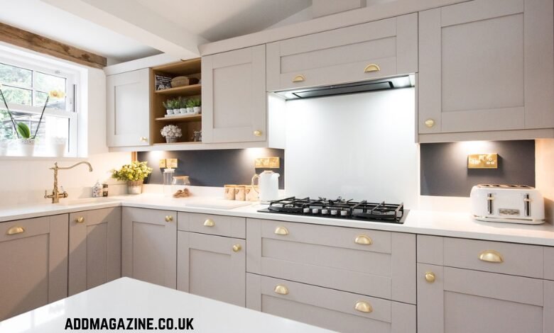
Then we have greige. A few years ago everyone wanted cool flat grey but that trend felt quite cold. Greige brings the warmth of beige back into the mix. It is modern yet enduring and it can accomodate almost any style of flooring you happen to have lying around.
Sage green is probably my favourite right now. It feels earthy and calm. Paint companies like Benjamin Moore rank green very high with homeowners because it brings a bit of nature indoors. Muted mineral greens look incredible next to wood accents. They have this heritage feel that never really goes out of style.
I suppose the trick is keeping the saturation low. A soft pale green is timeless.
Adding Depth With Charcoal And Navy
So here is the tricky part about neutrals. Sometimes they need a bit of grounding so the room does not float away. Two tone kitchens are brilliant for this.
A very popular approach is putting a lighter colour on the wall cabinets and a darker shade on the island or the lower units. Dark blue base cabinets paired with light worktops and warm lighting just works. It gives the room some weight. Navy is one of those darks that still reads as a neutral to most people.
Charcoal grey does a similar job. It looks incredibly smart. I actually prefer it to harsh black because it is a bit softer on the eye. If you pair charcoal units with some brushed brass handles you get a very premium look.
Speaking of handles I once spent three weekends trying to drill new holes for some vintage brass pulls I found at a market. I ruined two doors before I realised I was using a masonry bit. Before working on your cabinets, make sure every tool you need is in good condition and ready to use.
Anyway dark accents are classic. They hide scuff marks near the floor too.
How Matt And Satin Finishes Change Things
The colour you choose is only half the battle. The finish changes everything. A lot of interior advice recommends satin or semi gloss finishes for kitchens. They are slightly reflective which helps with light but more importantly they are hardwearing.
A soft matt look feels very contemporary. The great thing about matt is that it hides minor imperfections on older doors. If your cabinets have seen better days a matt finish can mask a lot of sins.
You do have to be careful with cheap matt paint though. It can mark easily if you just brush it on yourself.
That is why professional application matters. When you get a factory smooth finish it completely changes how the paint behaves.
Achieving Colour Without Replacing Cabinets
Replacing a whole kitchen is a massive headache. It costs a fortune and creates mountains of waste. Kitchen respraying is a much smarter alternative. You keep your existing layout and carcasses but you get a brand new look. It is the most cost effective way to get these premium styles.
Professional refinishers use automotive grade paints. These are not the sort of emulsions you buy in a plastic tub at the hardware store. They are engineered to bond to hard surfaces and withstand daily use. Fixation can actually match any RAL colour.
Quality is always a worry when you hire someone. You hear horror stories. But using NVQ qualified technicians makes a huge difference. They know how to prep sand and mask everything properly before a single drop of paint is sprayed.
Plus a 12 month guarantee gives you some peace of mind. It is nice to know the finish is expected to hold up to boiling kettles and messy cooking.
It also saves tonnes of perfectly good units from ending up in UK landfills.
Coordinating With Existing Worktops And Floors
That said it is not always simple to just pick a colour you like. You have to look at what is already in the room. If you are keeping your worktops and flooring your new cabinet colour has to play nicely with them. Warm whites look great with dark granite. Greige is a lifesaver if you have orange toned oak laminate because it cools everything down.
I remember renting a flat in my twenties that had bright yellow walls and a red vinyl floor. It gave me a headache every morning while I made toast. Colours that fight each other will ruin the feel of the space. You want harmony.
Lighting is the other big factor. A colour that looks gorgeous in a showroom might look completely different under your kitchen spotlights. Always test swatches in the actual room. Look at them in the morning and then look at them again at night.
Final Thoughts
Upgrading your home should be exciting but I know it usually just feels exhausting. They are forgiving colours that make a house feel like a home.
You do not have to spend ten grand to feel proud of your space. Using what you already have and giving it a professional respray is just common sense. It respects your budget and it respects the environment.
Keep it simple keep it neutral and let the rest of your life provide the colour.