For many small online retailers, growth feels like a choice between spending more on ads or rebuilding the whole store. A Shopify store can increase sales by simplifying the shopping experience, building customer confidence, and removing obstacles from purchasing. The most useful improvements are rarely dramatic. They are practical changes that remove uncertainty from the customer journey.
This matters for business owners, side-hustle founders, and growing ecommerce teams who need better results without adding unnecessary complexity. A clearer product page, a more reassuring cart, a better mobile experience, or a focused app in the right place can sometimes do more than another campaign sending traffic to the same weak buying path.
Why Increasing Traffic Isn’t Always the Best Starting Point
Traffic is important, but it does not solve every sales problem. If shoppers are confused by product information, surprised by shipping costs, unsure whether the store is legitimate, or frustrated by checkout friction, more visitors simply create more missed opportunities.
Every page has a job. The homepage should explain where the visitor is and what the store offers. Category pages should make comparison easy. Product pages should answer buying questions. The cart should reduce hesitation. Checkout should feel predictable and secure.
When those jobs are done well, marketing spend works harder because existing visitors have a better chance of becoming customers.
Begin by identifying where the journey is losing momentum.
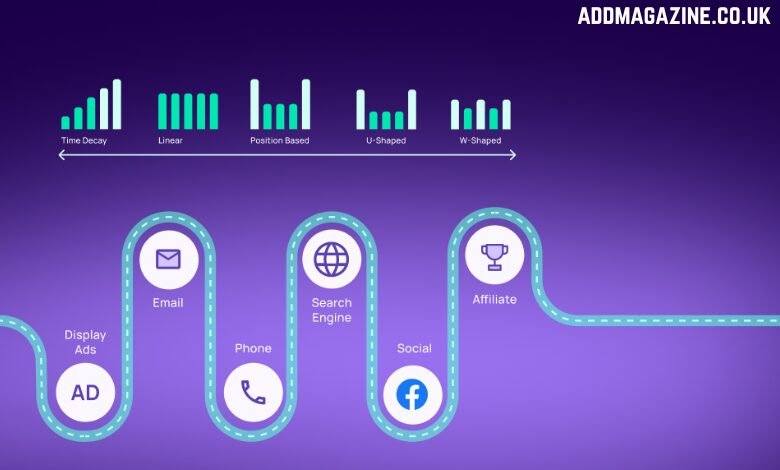
Guessing is expensive. Shopify merchants already have useful data inside their analytics dashboard, including sessions, product views, add-to-cart behaviour, reached checkout, completed checkout, popular products, traffic sources, and device split. These numbers help identify where shoppers are slowing down.
If visitors are reaching product pages but not adding items to cart, the issue may be the product offer, page copy, price clarity, trust signals, photos, variant selection, or delivery information. If carts are being created but checkout is weak, the problem may be discount confusion, shipping expectations, payment reassurance, or a cluttered cart. If checkout starts but orders do not complete, look for final costs, account friction, payment options, or mobile form problems.
This simple diagnosis prevents random optimisation. Instead of changing everything at once, the retailer can fix the stage that is most likely holding back sales.
Transform your product page into an effective sales asset that encourages more shoppers to complete their purchases.
A product page should not rely on the shopper to piece together the value. This is especially important for small brands that do not yet have the recognition of a major retailer.
Useful product pages often include:
- Short details about size, material, compatibility, fit, ingredients, use, or care
- Product photos that show scale, texture, context, and included items
- Delivery, returns, warranty, or exchange information close to the buying decision
- Reviews or customer proof where available
- A visible call to action that is easy to use on mobile
The aim is not to make the page longer for the sake of it. The aim is to remove the questions that commonly stop a shopper from acting. If customers often ask the same questions before buying, those answers belong on the product page.
Build trust where decisions happen
Trust is not a single badge or phrase. It is the overall feeling that the store is real, reliable, and fair. Small online businesses can build that feeling through consistency: accurate product information, clear policies, visible contact options, real reviews, honest delivery timelines, and payment reassurance.
Trust signals work best near decision points. A return policy hidden in the footer may technically exist, but it might not help a shopper hesitating beside the add-to-cart button. A short note such as “30-day returns”, “Ships in 1–2 business days”, or “Secure checkout” can be useful when it is true and placed where the shopper is making a choice.
Retailers should avoid overpromising. Vague claims like “best quality guaranteed” are weaker than specific, believable promises. If there is a warranty, explain it. If delivery takes three to five working days, say so. Clear expectations create confidence.
Keep promotions simple enough to notice
Promotions can lift sales, but only when customers understand them quickly. A discount hidden in a banner, a free-shipping offer that appears too late, or several competing popups can make the store feel noisy rather than persuasive.
A stronger approach is to run one primary message at a time. That might be free shipping over a threshold, a seasonal discount, a bundle offer, or a limited-time launch promotion. Repeat the message in the few places where it helps: the announcement bar, relevant product pages, the cart, and any checkout-adjacent area your theme supports.
Specific wording usually performs better than generic urgency. Specific promotional wording makes an offer easier for customers to understand. Likewise, “Purchase two items and receive 15% off” gives shoppers useful information that “Special deal” fails to provide. Effective promotional copy removes unnecessary guesswork and communicates value clearly without relying on loud or exaggerated language.
Let apps strengthen your approach rather than allowing them to replace thoughtful planning.
Shopify apps can be useful, but a large app stack is not automatically a better store. Every app should have a clear purpose. It should help shoppers understand the offer, trust the store, notice a relevant promotion, compare options, feel reassured in the cart, or complete checkout with less friction.
For retailers comparing Shopify apps to increase sales, the best approach is to choose lightweight tools that support a specific buying decision rather than adding widgets simply because they are available.
That means starting with the customer problem. Add trust badges if shoppers need reassurance about payment, delivery, returns, or guarantees. Add an announcement bar if an important offer is easy to miss. Add feature icons if they make product benefits easier to scan.
The right app should make the store feel clearer, not busier. A feature that creates loading delays, interrupts browsing, repeats information already shown, or complicates checkout can ultimately hurt conversions instead of increasing them.
Make the cart calm and practical
The cart is one of the most valuable parts of the customer journey because the shopper has already shown intent. It should confirm the product, show the price clearly, explain any discount, set delivery expectations, and make the next step obvious.
If there is a free-shipping threshold, show the remaining amount. If returns are simple, say so briefly. If payment options matter, make them visible without overwhelming the layout.
A cross-sell that fits the basket may increase order value. A large interruption that hides checkout may lower completion. The cart should feel like a bridge to payment, not another landing page.
Prioritise mobile before polishing desktop
Even when a customer first discovers a product on social media or search, the mobile store experience often determines whether they continue. A desktop layout can look excellent while the mobile version still has problems with tap targets, sticky bars, popups, image size, or slow loading.
Retailers should test the full journey on a real phone, not only in a desktop preview. Check whether product information is readable, whether accordions open cleanly, whether variant selectors are easy to tap, whether the add-to-cart button remains visible, and whether checkout forms feel manageable.
Speed also affects confidence. Compress large images, remove unused theme sections, review third-party scripts, and disable app elements on pages where they are not needed. A fast, stable mobile store can feel more professional than a visually impressive store that loads slowly.
Improve after the purchase as well
Sales growth does not stop at checkout. Small retailers should make order confirmations, delivery updates, usage guidance, return instructions, and support routes easy to understand.
This is particularly important for products that need sizing, installation, setup, care, refills, or compatibility checks. A customer who feels guided after purchase is more likely to trust the store again.
The post-purchase experience also feeds back into future conversion. Better communication leads to fewer complaints, stronger reviews, and more confidence for new shoppers reading the page later.
A simple improvement routine
Small online retailers do not need a complicated optimisation programme. A simple routine can be enough:
- Choose one weak stage in the customer journey.
- Review that stage on mobile and desktop.
- Measure the closest relevant metric for a reasonable period.
- Keep what helps, refine what is unclear, and remove what adds clutter.
This routine is manageable for lean teams because it avoids constant redesigns. It also keeps attention on the real goal: helping shoppers make confident decisions.
Conclusion
Improving Shopify sales does not have to mean making the store louder, heavier, or more complicated. Clear product pages, honest policies, visible trust cues, easy-to-understand offers, a clean cart, fast mobile performance, and thoughtful post-purchase communication all help shoppers feel more confident.
Focused apps can support that work when they solve a real problem, but they should never replace basic store clarity. For small retailers, the strongest ecommerce strategy is often the most practical one: find where customers hesitate, remove the friction, and make the next step easier to take.